Analytics setup tool

The challenge
Advertisers on Facebook want to know if their ads drive people to take actions such as making a purchase or signing up for a newsletter. But to measure these actions or “events” as Facebook calls them, marketers need to add code to their website. We developed a tool to allow people to add tracking without having to know code.
My role
I worked with a UX designer to build the IA and UX logic. The tool had many micro interactions and micro copy so language was critical and often shaped design.
The results
In early beta testing, 70% of new users were able to launch the experience, set up, save, and verify an event within 1 minute.
Skills
UX Writing, Information Architecture, Content Testing
Launching the tool
-
Before redesign
Advertisers get a modal with a list of instructions on how to paste tracking code into their website—a daunting task for most.

-
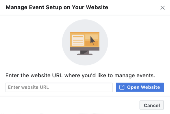
After redesign
Advertisers enter their website URL into a simple modal which opens their website and activates the Facebook setup tool.
The tool in action
When the Facebook tool is launched, advertisers see a draggable control panel that sits on top of their website and shows events they may have added in the past, as well as new buttons or text links that Facebook thinks may be worth tracking.

The control panel

I worked closely with a UX designer and engineers to translate what was happening in code on the backend into intuitive content for the “codeless” frontend.
Content density
All of the details of every event on a specific page need to fit into this narrow control panel: the event category, whether it’s being tracked or not, whether it’s a button or a link, as well as the text on the button or the link URL. All of these content details need to be communicated quickly and displayed efficiently to orient the user and help them understand what they’re seeing.Content sequencing
The experience within the tool isn’t linear. The user doesn’t need to move sequentially to complete a single task and in fact needs to self direct more than in a conventional flow. In research, we found some users didn’t know where to start. We focused on varying weight and positioning of different CTA text to emphasize the most important tasks first and get users moving.Content modularity
The experience exists in multiple windows and layers — the Facebook advertiser dashboard, the setup tool and the advertiser website — so copy sometimes needed to explain if information was in a different place, without being overly directional.
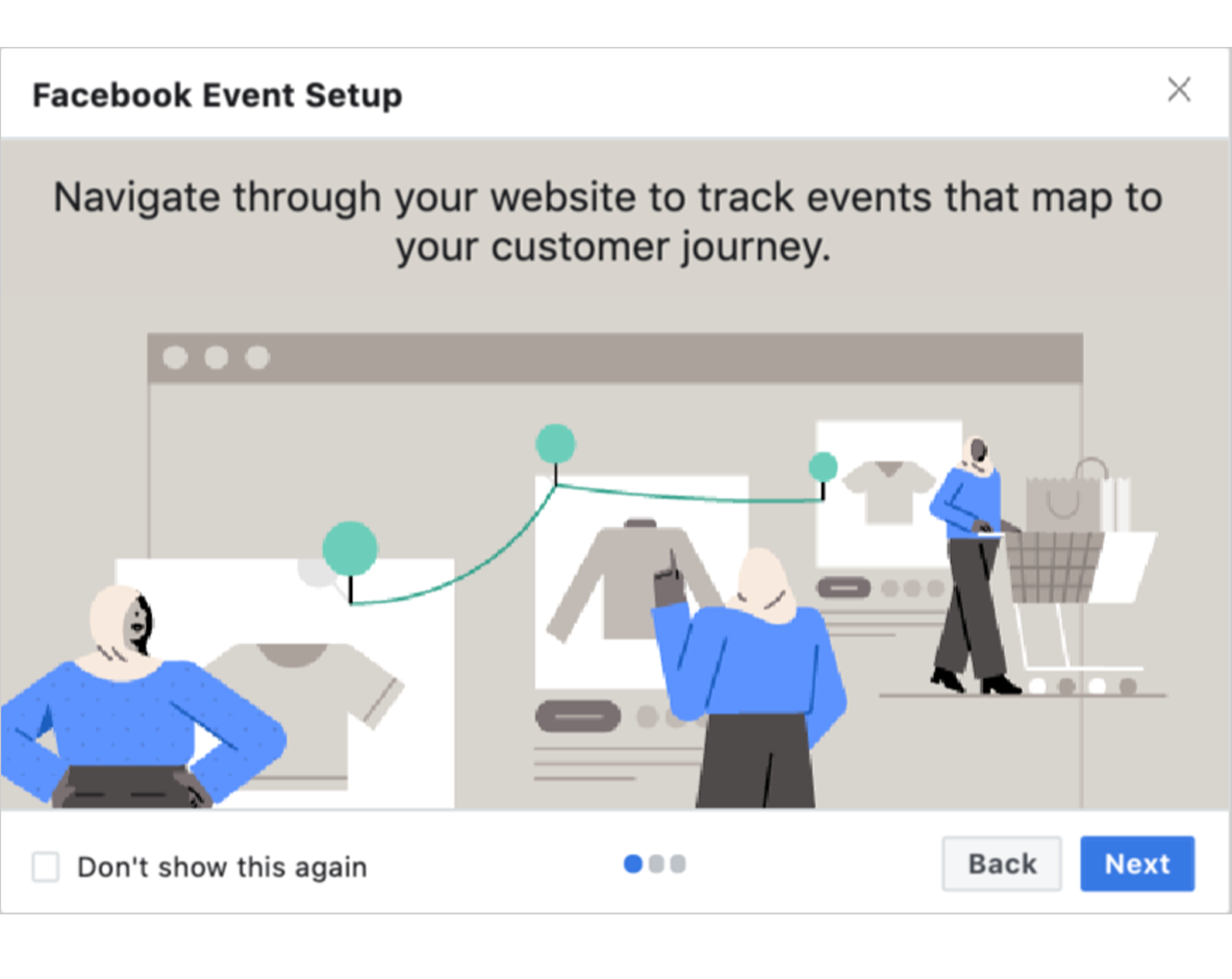
Onboarding
The first few times an advertiser visits, we served an onboarding carousel to introduce the tool. I drew on all of the user research we’d done to highlight and clarify the key points of confusion that had surfaced in testing and distilled it down to three simple introductory slides.
-
1. Product overview
A simple, high-level statement about what the tool can do in a way that speaks to both new and expert advertisers and expresses the product value prop.

-
2. How to navigate
People weren’t always sure where to start or which actions to track. Prompting people to think of their ideal user journey gave them a mental model.
-
3. How to set up tracking
Advertisers can add tracking, but Facebook also suggests events using AI. Copy prepared people to expect events “found” by Facebook.
